
Corporate Design System.
Executive summary
Goal
Rebuild the corporate design system I helped create inside Adobe Experience Manager as a portable React component library.
My role
Design system architecture | Component design | Front-end development | Internal tools | Brand stewardship
Team
Solo rebuild based on work created with the User Interface Center of Excellence, offshore developers and design interns.
Timeline
2015-2025 system evolution. 2026 independent rebuild.
Constraint
The original system depended on AEM's proprietary HTL, Sling and OSGi architecture.
Proof
I cataloged 97 components and rebuilt them with React, TypeScript, Vite, Tailwind and Storybook.
Live system
Username and password required.
Overview
Designed by Chicago agency Avenue, the company's visual refresh launched in 2015 replaced its drab 2001-era corporate design system with a minimalist, consumer-friendly modern identity. The Intro font logotype. A playful "tu" monogram for digital spaces. A single vibrant turquoise. A deliberate shift away from the look of a traditional financial institution.
I spent the next decade working with and evolving this enterprise branding and design system with the rest of my team in the User Interface Center of Excellence. By the end of my tenure, we had standardized roughly 115 legacy interface patterns, delivered a pattern library many other teams could build from and established a single source of truth for color, typography and spacing.
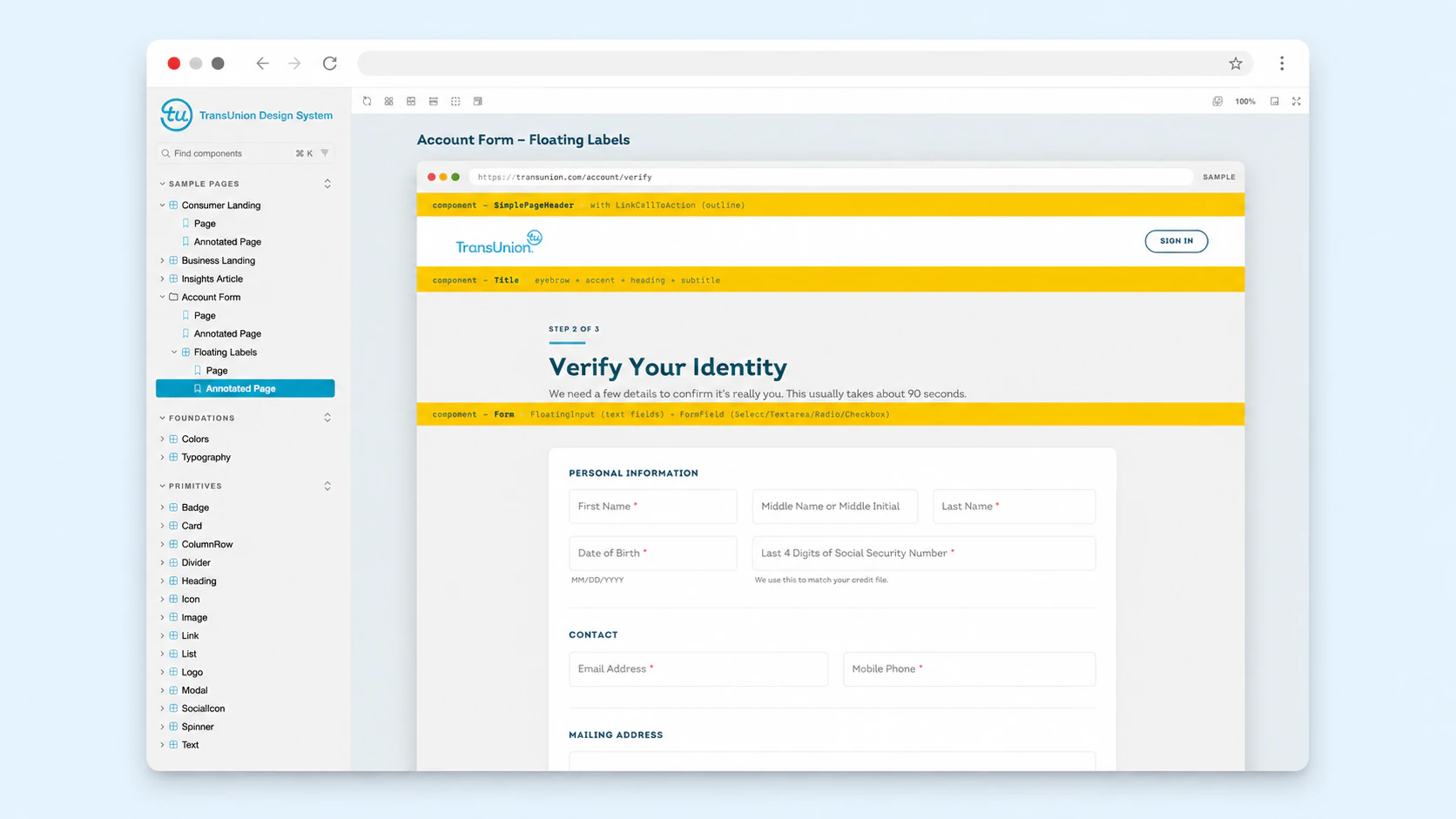
I rebuilt what once lived inside Adobe Experience Manager (AEM) with React, TypeScript, Vite, Tailwind, Storybook and the SCSS files I wrote against the original tokens. I repurposed a design system that had been locked inside a proprietary CMS, turning it into a modern, portable component library built on a popular front-end stack.
The platform was proprietary. The design language was not.
Process
Origin in UI Toolbox and CRS+
The design system started small. CRS+ needed a modern interface and a consistent component library to support an offshore HTML and UI team, so the team built UI Toolbox. A scrappy HTML and CSS starter kit with sample pages, buttons, form fields, tables and templates. Practical, useful, working. Not yet a system. Just enough to kick off and inform the CRS+ rebuild and to give other teams something to build from. As more teams started using it, the gaps became obvious.
From starter kit to design system
To reliably support growing teams, we evolved our early UI Toolbox into a formalized design system. We codified color, typography and spacing into unalterable tokens. From there, I designed high-fidelity, pixel-perfect components in Photoshop for our offshore engineers, backing them with precise visual specs, HTML, CSS and clear documentation.
Scaling across the enterprise
The mature system became infrastructure. Internal teams gained a credible, on-brand starting point for their tools, allowing them to self-serve and giving our design team its queue back.
The design system became infrastructure: a credible starting point teams could use without waiting for us.
From AEM to React
I rebuilt the design system as a standalone portfolio project after leaving the company, moving entirely outside AEM's proprietary HTL, Sling and OSGi architecture. I cataloged 97 components and reconstructed them in React, TypeScript, Vite, Tailwind and Storybook. Design tokens flow through Tailwind configuration, CSS custom properties and typed TypeScript exports. The Storybook deploys to Cloudflare Pages.
Outcome
The design system shipped across almost all internal applications during my time there. CRS+, the UI Toolbox and the in-house tools other teams built from the UI Toolbox all ran on it. After I left, the visual layer continued to define the company's product surfaces.
A system that used to require a proprietary, enterprise-level platform now runs in any modern React environment. The Storybook view of every component lives at the same Cloudflare deployment. The codebase is set up to grow into a broader portfolio piece with the help of AI coding harnesses. The next phase is tightening the component props, porting the remaining interactive behavior and using the system to build new things.
A design system's DNA is portable.