
CRS+.
Executive summary
Goal
Replace the antiquated system customer service representatives use to manage credit disputes, fraud cases and all account maintenance.
My role
UX lead | User research | Production handoff
Team
UI Center of Excellence, product stakeholders, senior leaders, offshore developers and design interns.
Timeline
Multiyear rebuild.
Constraint
The legacy system was slow, hard to learn and packed with fields that did not apply to the task.
Proof
Training time dropped. Data quality improved. The component library became the foundation for later work.
Live system
Username and password required.
Overview
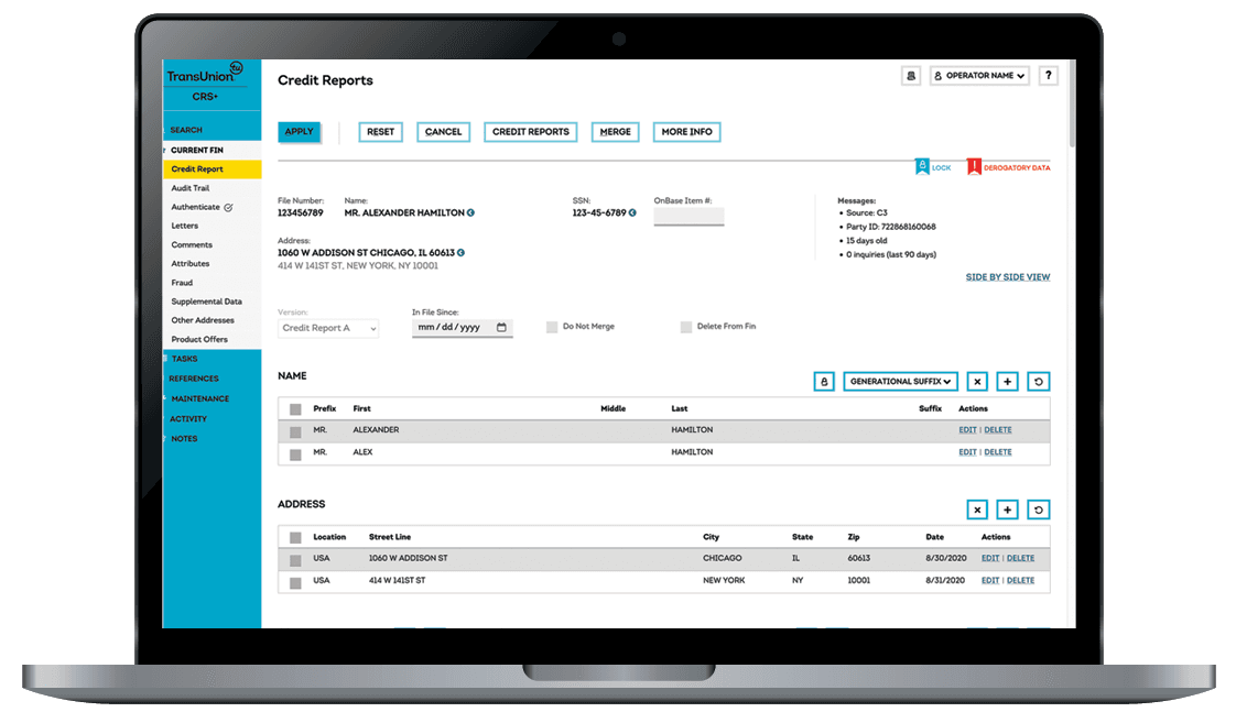
CRS+ was a multiyear rebuild of the Consumer Relations System, the platform customer service representatives (CSRs) used to handle credit disputes, fraud cases and all other account-maintenance workflows affecting consumers' credit reports and credit scores. The legacy version, CRS 3.0, was a dense thicket of forms and tabs built for a different, bygone era. It was slow, hard to learn and out of step with a company that had rebranded and gone public.
I led UX on the rebuild from user research through production handoff.
Process
Research and strategy
I ran stakeholder interviews and observed CSRs working in CRS 3.0. The patterns came up quickly: too many clicks to resolve a dispute, no clear sense of where in a workflow you were, screens full of fields that didn't apply to the task at hand. I synthesized the findings into UX and UI goals that the team designed against for the next three years.
The legacy system reflected how it had been built, not how representatives actually worked.
Information architecture
I led collaborative whiteboard sessions with cross-functional partners to map workflows and rebuild the IA from scratch. The legacy app had grown by accretion. Pages had been bolted on as new compliance requirements came down. We pulled it apart and put it back together as a coherent system, then formalized the work into site maps that both design and development used as their reference.
Brand alignment and accessibility
TransUnion had just rolled out a new corporate identity tied to its IPO. Every screen in CRS+ needed to live inside that system: typography, color, navigation patterns, components. WCAG 2.0 AA compliance was a hard requirement, not a nice-to-have. That shaped color decisions, focus states, keyboard navigation and form design throughout.
High-fidelity design and front-end delivery
I built every screen in Photoshop at full pixel fidelity. The mockups specified layout, type, color and interactive states down to the detail and served as the single source of truth for an offshore HTML and UI team I directed. I stayed close to front-end implementation, reviewing code and pushing on fit and finish until production matched intent.
The handoff was not complete until production matched the design intent.
Outcome
CRS+ replaced a legacy system that had been overdue for replacement for years. The wins came in across the rollout:
Training time for new agents dropped because the workflows finally matched how the job is actually done.
Data quality improved as cleaner input validation and smarter form design cut down on errors that had been baked into the old system.
The component library and design system built during the project became the foundation for future work, lowering the cost of every subsequent change.